GREEN & BLACKS ➝ Crafting a delicious new icon.
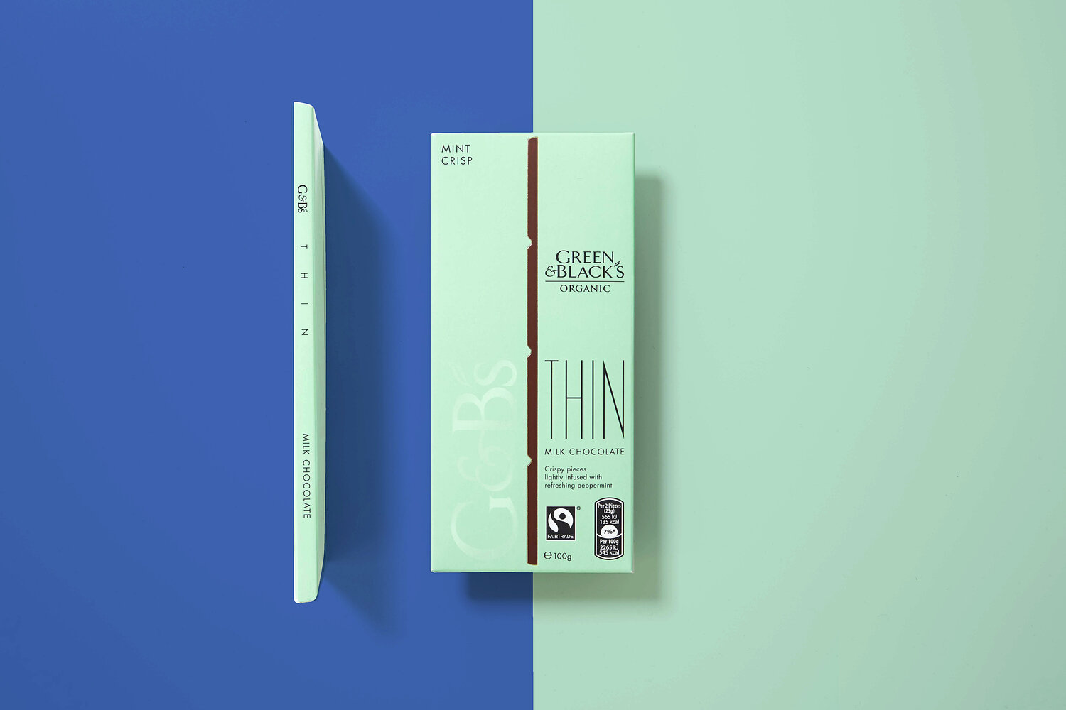
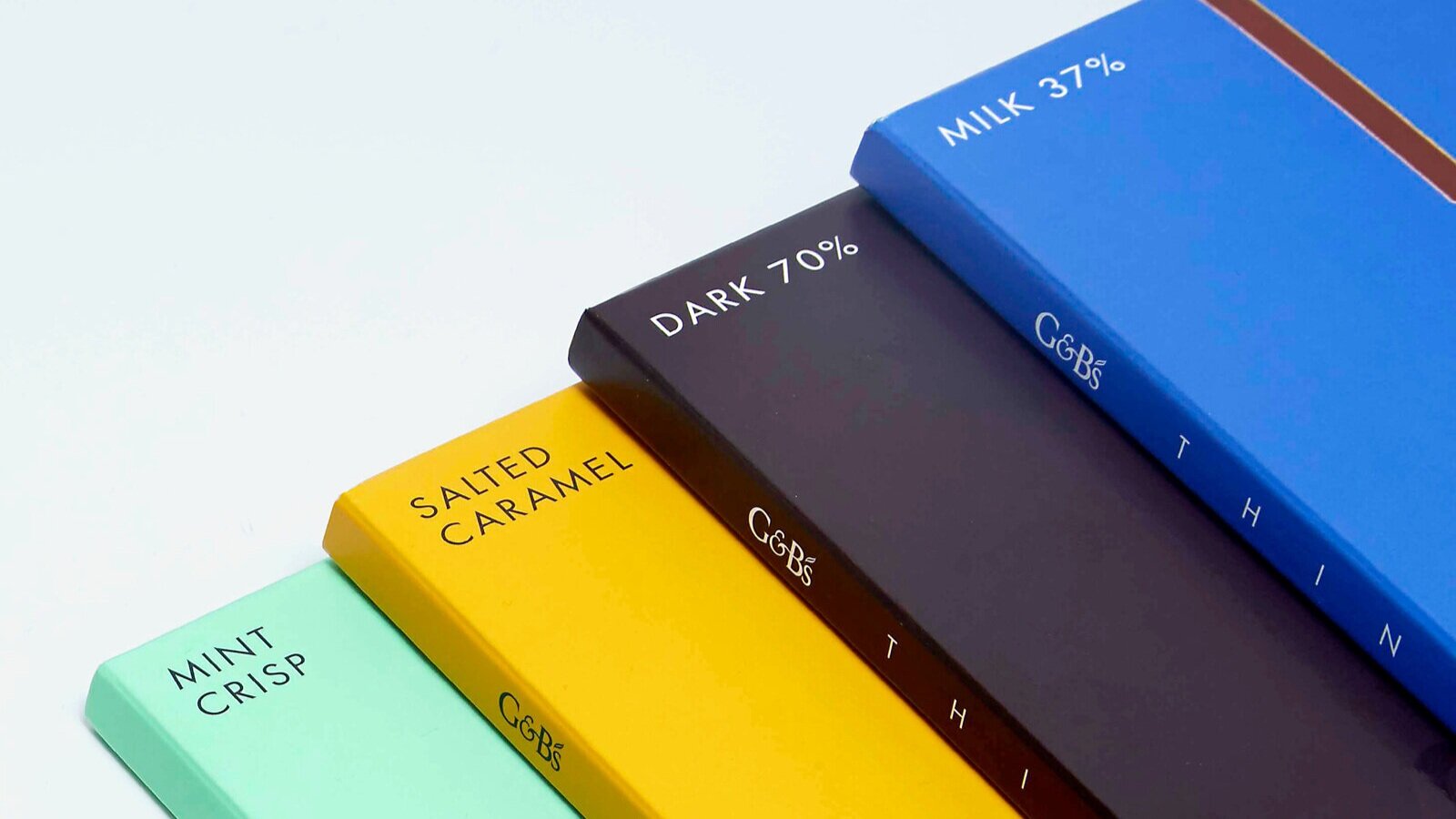
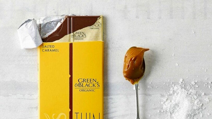
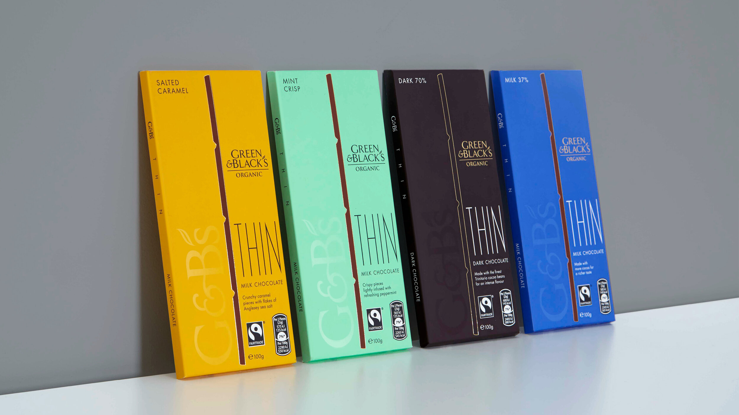
We were briefed to design an iconic packaging range for Green & Black’s first product innovation in 23 years – The THIN Bar. The challenge was to create differentiation in a crowded market, borrowing from Green & Black’s inimitable style whilst also signaling the newness of the THIN format within the Green & Black’s range.
Our research demonstrated that the chocolate category had become increasingly loud and dominated by noisy packaging. The best way for an elegant new chocolate bar to stand out was to exude quiet confidence.
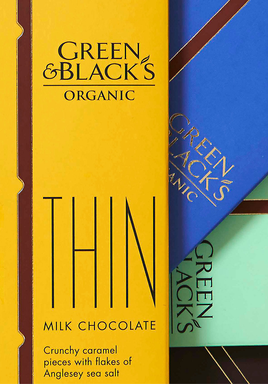
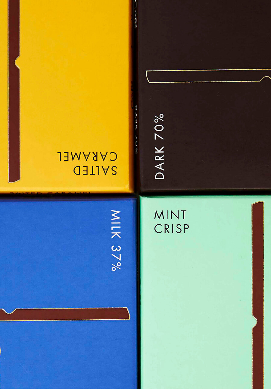
The result was a purposely sparing design that retained the iconic G&B’s colour palette, creating synergy with the original range, but adopting a subtle a new icon – the THIN bar – shown in profile, proudly positioned at the heart of the design in ‘actual size’. This simple move hinted at the elegance of the bar encased within.

