RIBA ➝ Amplifying brand application, to inspire and excite different audiences.
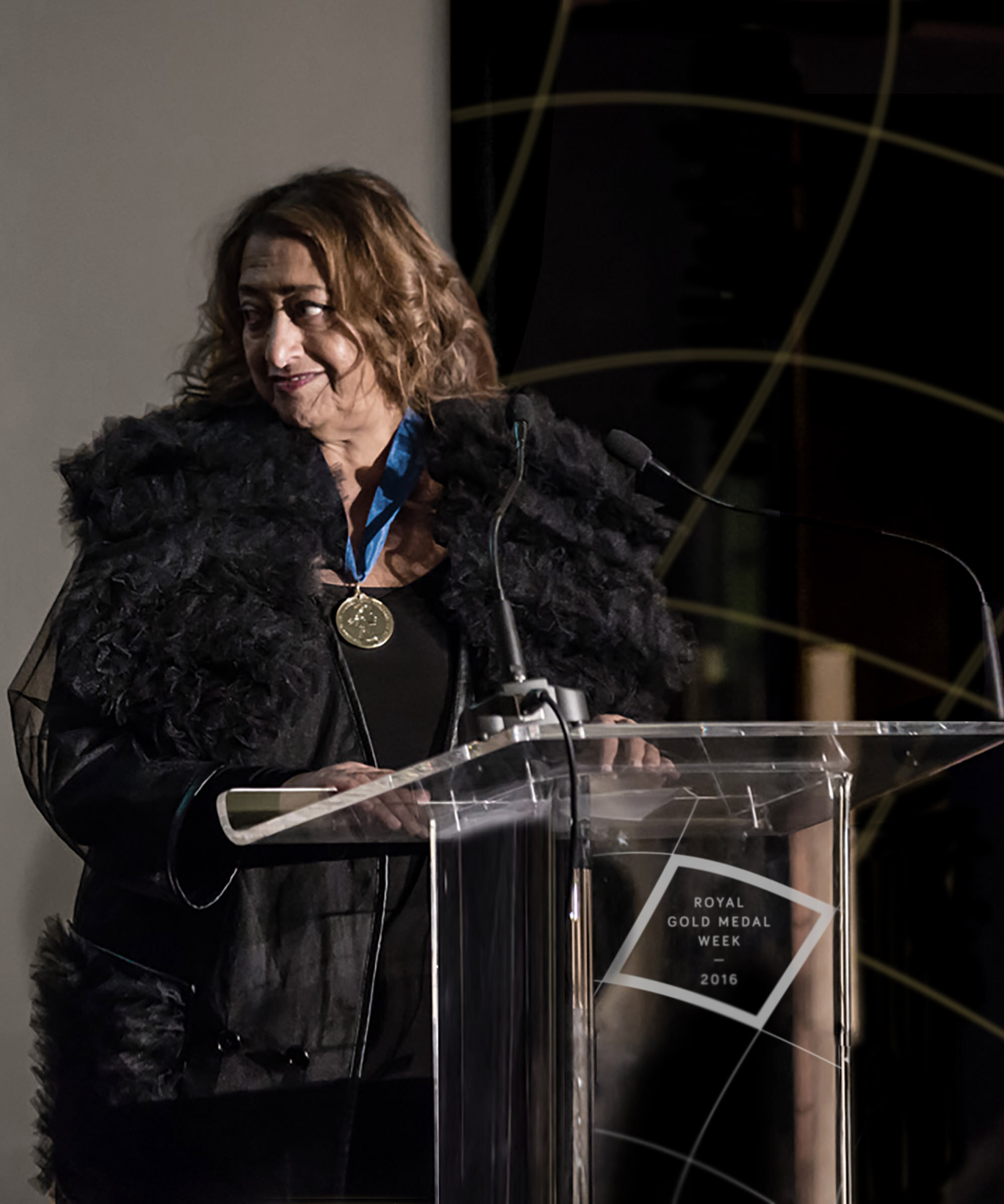
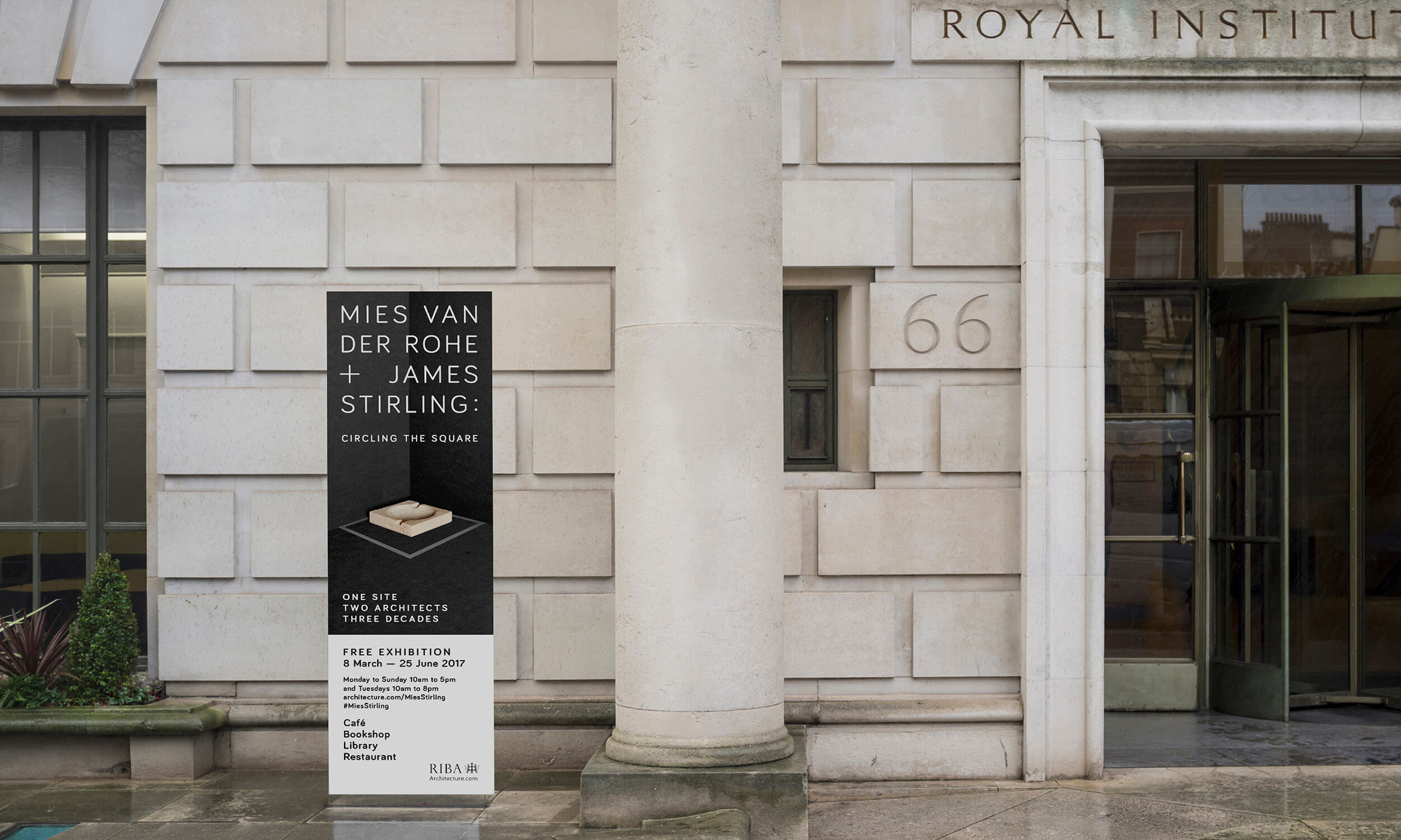
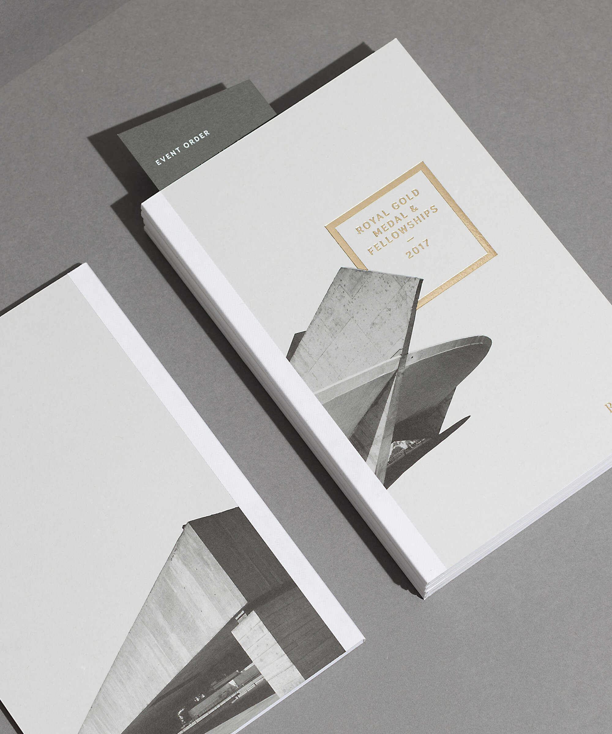
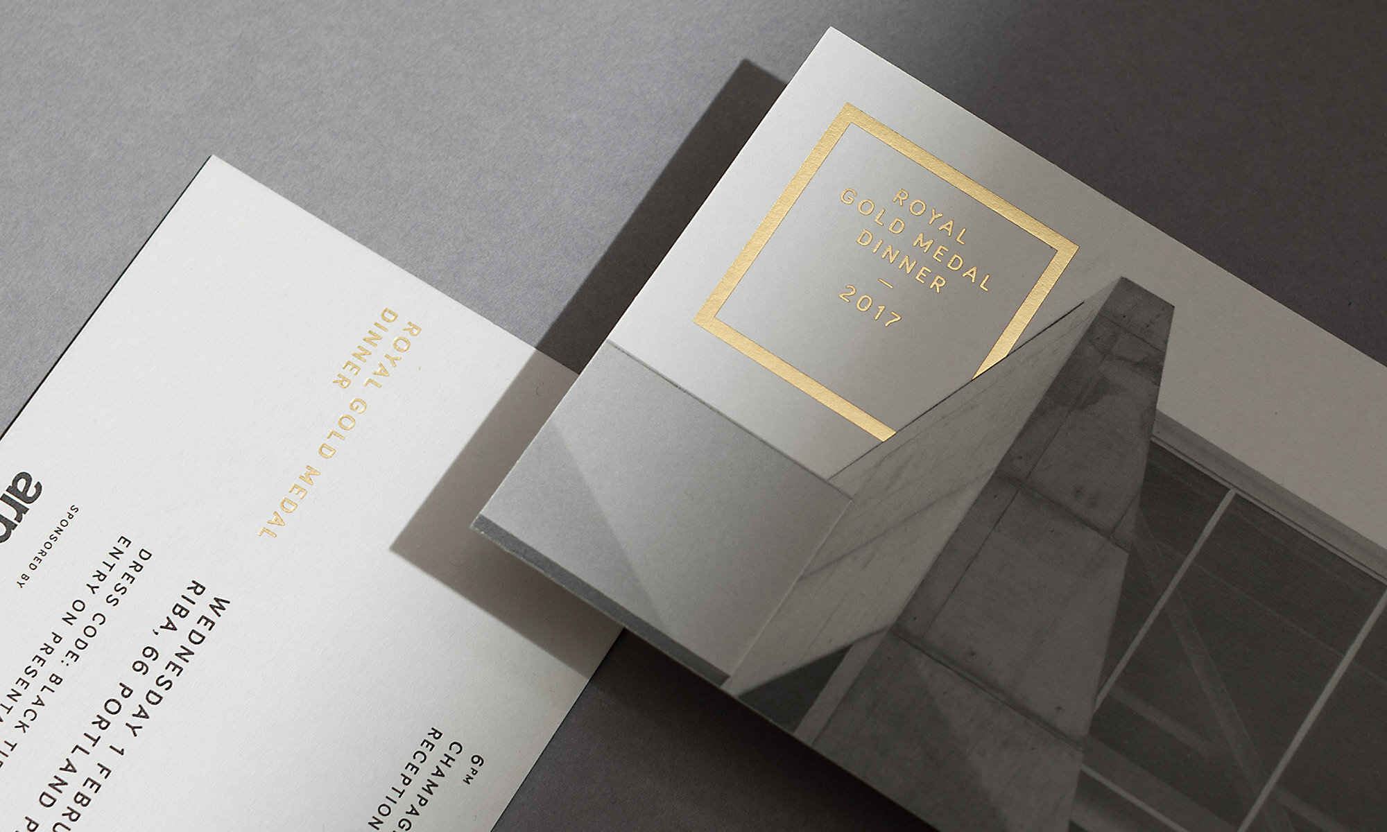
As the worlds foremost architecture establishment, the Royal Institute of British Architects produces a full programme of inspiring events throughout the year. Our relationship with RIBA has covered a number of these events from identities for the prestigious Royal Gold Medal prize, to exhibitions on Palladio.
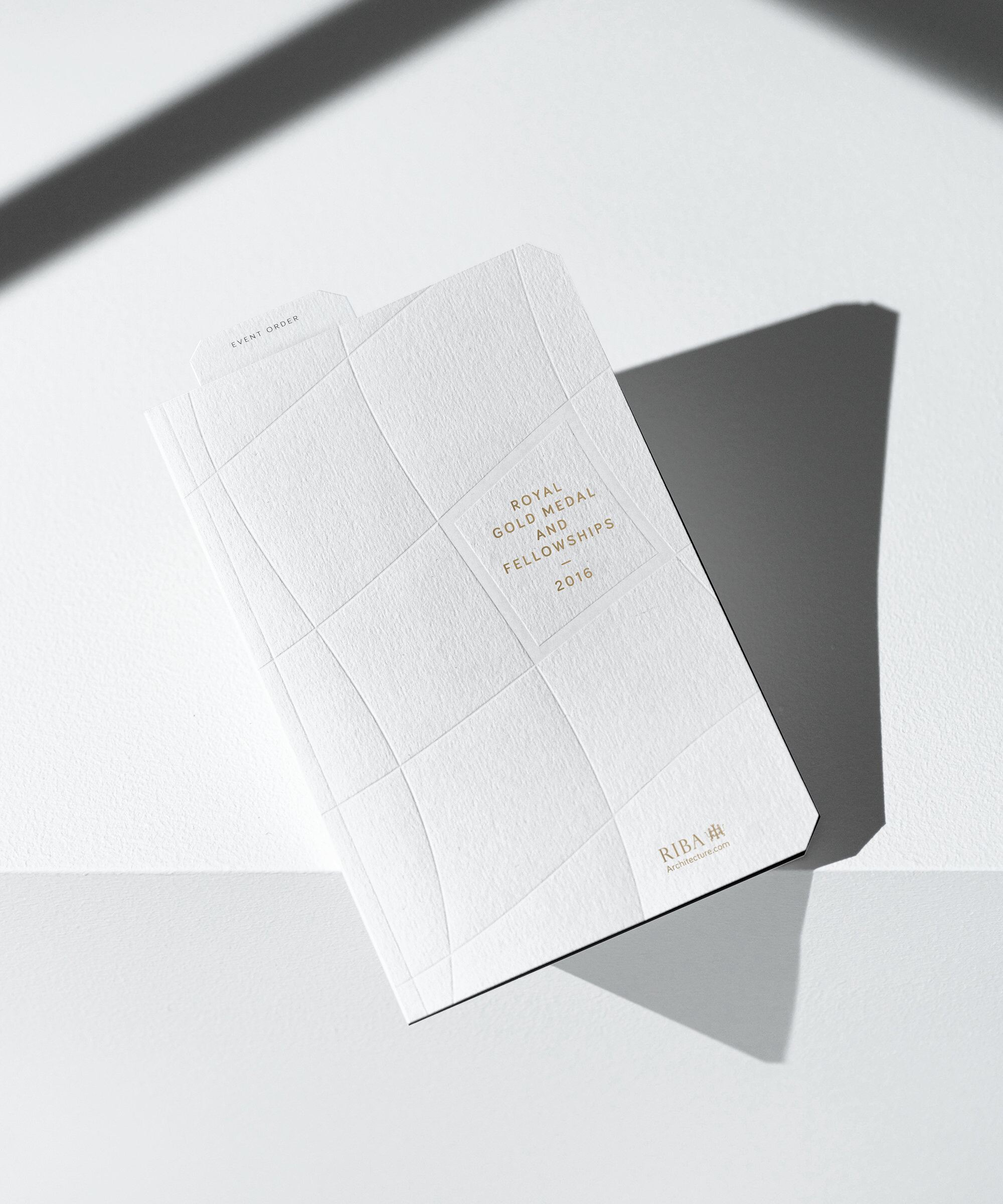
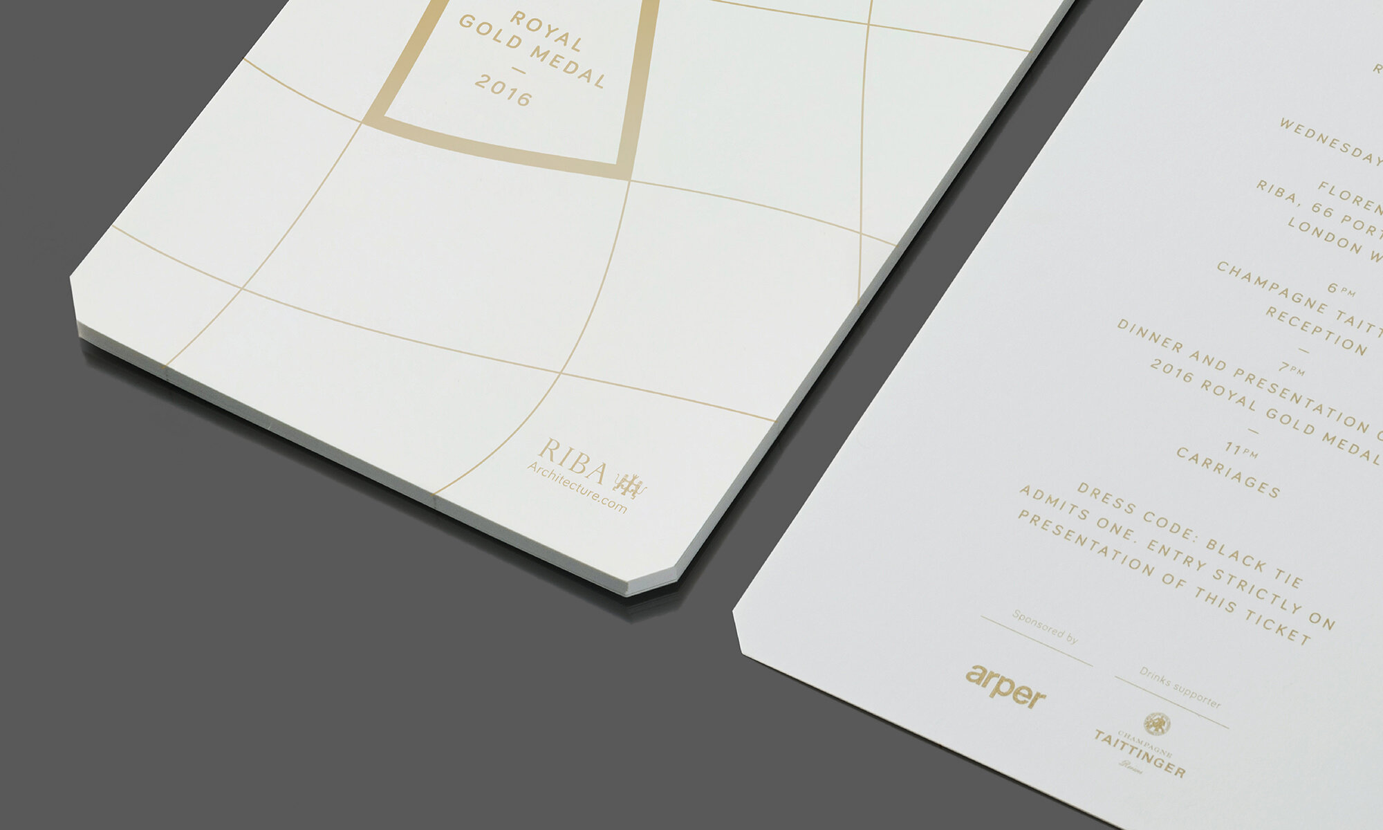
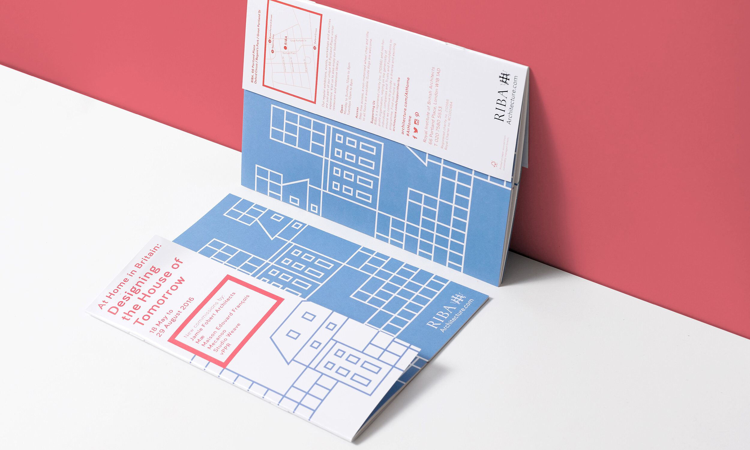
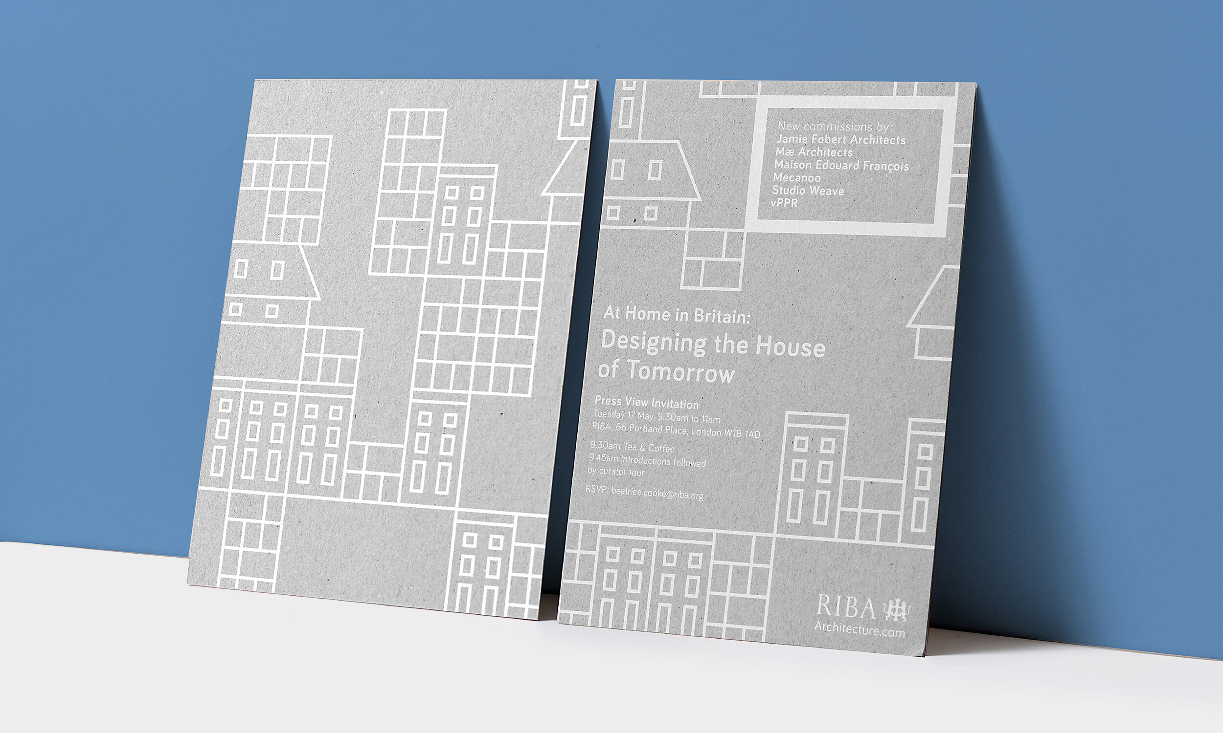
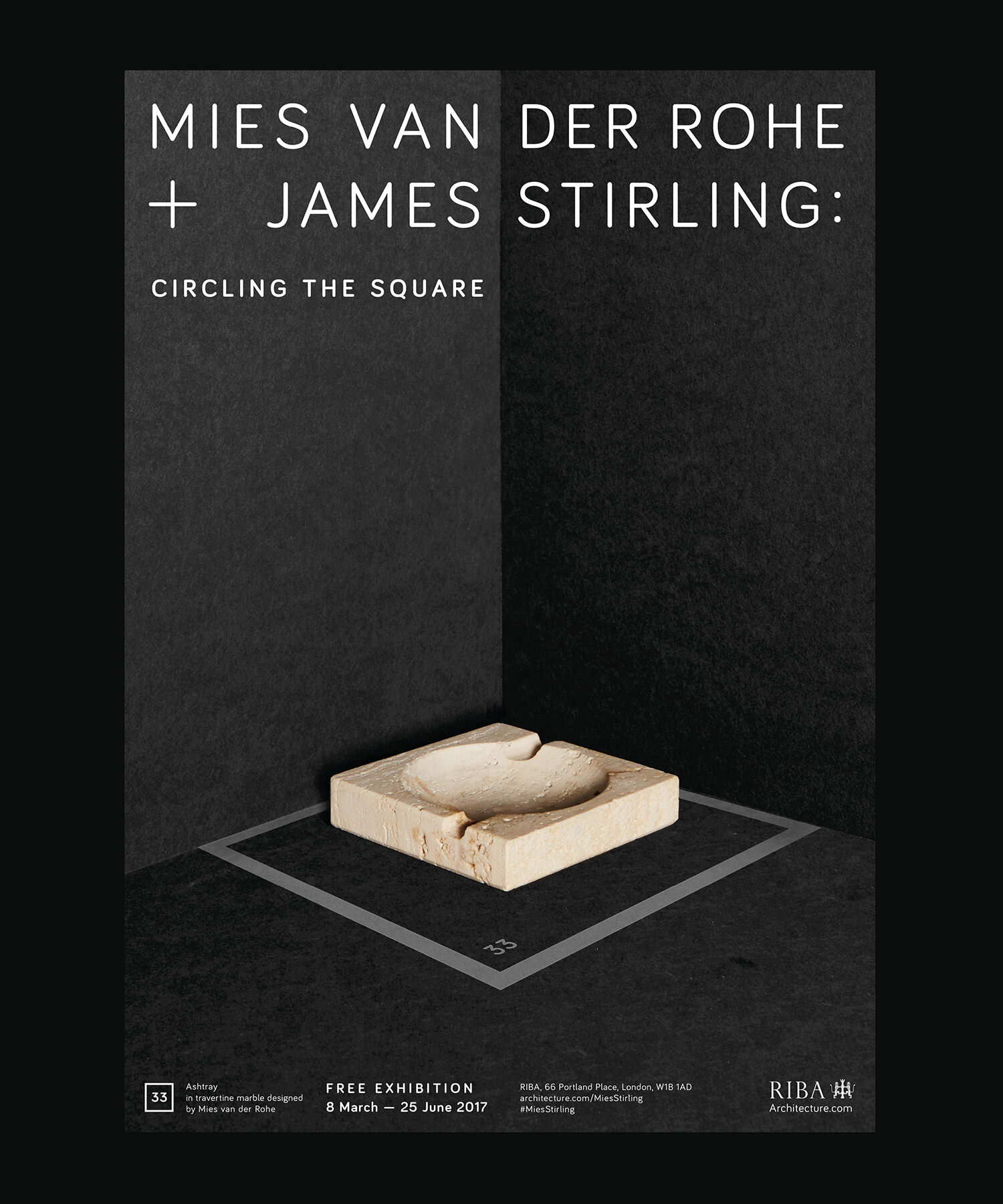
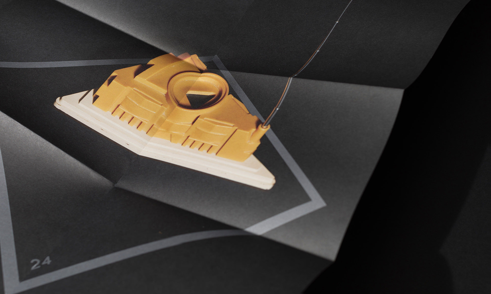
As a result we have been able to explore how the identity responds to diverse audiences and subjects. It’s long established heraldic symbol is a prominent and recognisable mark of expertise and heritage. In contrast, the modern framing device can be used as an active part of the communications. Although in most cases the team found it was not sensitive or responsive to the subject.
By interweaving or manipulating it to reflect the topic, we have created direct connections between RIBA and the subject or architect. Stimulating new discussions, new audience demographics and highlighting hidden details of interest.